Thursday, 31 October 2013

Curri Ghost Theme

Curri Ghost Theme

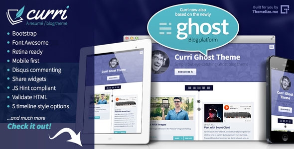
Curri Ghost theme is a simple but eye catching Ghost blog theme with Ghost 0.4.2 & 0.5.x support along with many slick features.

It’s the follow up to our Curri HTML theme (http://themeforest.net/item/curri-retina-ready-cv-template/5149358).

The theme is built with Twitter Bootstrap 3.2.0 and features a timeline blog list with 5 different timeline styles to choose from. Its fully mobile first and responsive and supports all types of media within posts (images, videos & sound clips) and even Tweets & Facebook Statuses! Disqus commenting is also supported.Behind the design, the theme supports both Facebook & Twitter meta tags & provides rich snippets support (schema.org) to make your theme stand out in search results!!

Key Features:
  • Built on Bootstrap 3.2.0
  • Font Awesome icons 4.2.0
  • Ghost 4.2.0 & 0.5.x support
  • Retina Ready!
  • New: Infinite Scroll pager or traditional pager
  • New: Embedded Tweet & Facebook Status support
  • IcoMoon Icons
  • Mobile first & Fully responsive (wide, normal, narrow, mobile)
  • Clean well commented code, easy to customise
  • Simple, bold, clean design
  • Valid HTML5
  • JSHint Compilant
  • Google font (OpenSans)
  • Drop down mini menu
  • Featured media support (first image, video or sound clip in post is used)
  • Disqus commenting
  • Slick share widgets
  • Share widgets
  • Sticky post header
  • Rich snippets support (schema.org)
  • Facebook & Twitter meta data built in
  • Regular updates

CHANGELOG

version 1.3, 27/10/2014

  • Ghost 4.2.0 & 0.5.x support
  • New: Author profile pages & multi user support, see: author.hbs
  • New: Support for tags pages, see new tag.hbs file
  • New: Support for home template, see new home.hbs file
  • New: Support & example of Custom Page Templates, see new page-contact-us.hbs file
  • New: plurals helper example, see: home.hbs
  • New: featured post tag
  • New: Use “post image” on index & post if present
  • Added package.json file
  • Swapped pageUrl to page_url usage
  • Bootstrap 3.2.0 upgrade
  • Font Awesome 4.2.0 upgrade

version 1.2, 12/02/2014

  • Ghost 4.0.1 enhancements (static pages, menu & error template)
  • Bootstrap 3.1.0 update
  • Font Awesome 4.0.3 update
  • Added animate.css transitions
  • Minor documentation changes

version 1.1, 27/11/2013

  • New: Added support for Infinite Scroll pager jQuery plugin
  • New: Added embedded Tweets & Facebook Status support

version 1.0, 31/10/2013

  • Initial release

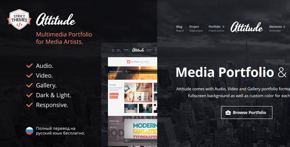
Attitude: Multimedia Portfolio for Media Artists

Attitude: Multimedia Portfolio for Media Artists

If you like the theme, please don’t forget to rate it

What customers say about my themes

First of all, congratulations for the theme. So elegant, functional and aesthetic. I am very happy with it. – chemabonilla
Big thanks for your fast response. I bought about 10 themes here and i can say that your support its really great. Thanks so much. – astronautonacow
Great response time, seriously I think it’s the best I have ever had here. You have a new follower my friend! Will be sure to rate the theme. Thanks again! – Prohibit
Wow thanks for the quick reply! Rated it! – arnoldjchang
Hi, first of all, just wanted to thank you for your work and theme! I love it!! – arnoldjchang
Great theme, cool features! – arnederynck
I am creating my first website and am learning as I go… So far, I am really enjoying the theme and I love the gallery format. – allisonhaubrick
I am really impressed with your quick responses and patience with the learning curve I am experiencing – allisonhaubrick
Hi, I just buy your theme and it’s very clean. Thanks for the job. – Hiflo
Thank you for this very cool and easy to set up theme… – zamsam
The new updated works perfect. Now voted with five stars. Great theme, great support. Thanks! – astronautonacow

Key Features

All Features

Theme Features

  • Responsive and Mobile-optimized
    Don’t leave any of your visitors behind. All themes created by StrictThemes are fully responsive, and looks great on all kind of devices and screen sizes: from widescreen desktops down to tiny smartphone displays.

  • HiDPI Ready
    All themes created by StrictThemes are fully compatible with high-resolution screens like a laptops with Retina-display, so your text and images will look absolutely gorgeous!

  • Color Schemes
    The theme comes with two color schemes – Light and Dark.

  • Style Customizer
    Tweak a style with three clicks. Unlimited colors.

  • Translation Ready
    The theme has been designed from the ground up with translation in mind. It comes pre-packaged with a .po file containing all of the theme’s text strings, ready for translation.

  • Unlimited Sidebars
    With individual sidebar areas for the homepage, posts, pages, and portfolio projects, you can easily customize your sidebars for different parts of your site. In addition, you can create your own custom sidebars for any post, page, and project. However, if you don’t need multiple sidebars, you don’t have to use them – just use only predefined sidebars.

  • Search Engine Optimized
    Built with clean, semantic, and fully search engine optimized HTML5 and CSS3 code, all you need to do is add great content!

  • Clean, Valid and Well-Commented PHP & JS code
    Well-readable code is the key for a quick customization. No dirty code. No bloated code.

  • Valid HTML5
    All themes created by StrictThemes built with respect to W3C standards.

  • Clean CSS3
    CSS styles comes a very good structure and well-commented, so you’ll never being confused with a deep tweaking of styles.

  • Extended Documentation
    In addition to the dead-simple setup process and easy-to-use theme options panel, we have a comprehensive documentation online.

  • Free Bug-Fixes
    If you find a bug, I’ll do my best to fix it as fast as I can. I’m also committed to making sure my themes are 100% compatible with the latest version of WordPress the day it’s released. I test my themes on beta versions of WordPress, so when the final version is released and your web host upgrades WordPress automatically, you won’t need to worry about any down-time from an incompatible theme.

  • One Click Updates
    Now no need to download re-install theme after each fresh release. You’ll be informed about new release, so you’ll need to make just one click for getting update.

  • Dummy Data Included
    Want to start from a solid base like a demo? Okay, dummy data already included into package.

Portfolio Features

  • 3 Portfolio Formats
    Attitude comes with Audio, Video and Gallery portfolio formats.

  • Custom Background & Color
    An unique fullscreen background as well as custom color for each project.

  • Custom Slugs
    Set an unique slugs for project, category, and tag, e.g. if you’re illustrator you probably prefer to have an URL like site.com/illustrations/, not site.com/projects/.

  • Portfolio Migration From Other Themes
    Looking for a new showcase theme, but don’t want to lose your existing portfolio based on Custom Type Posts? ST Kit (framework) compatible with any taxonomy (post type, category, tag). Just set the same you have.

Blog Features

  • 3 Blogroll Styles
    The theme includes a total of three different blogroll styles.

  • Post Formats
    The theme supports the Standard, Image, Gallery, Audio, Video, Status, Quote, and Link post formats, with special styling for each one.

  • Gallery Format
    Add gallery with a few clicks. No need to worry about image sizes.

  • Audio\Video Formats
    Use Embedded or Self-hosted media.

  • Link Format
    Redirect option available.

  • Post Features
    Below Post Editor you’ll find a two additional metaboxes: Sidebar and Page Options. More about…

  • Post Page Tweaking
    All themes created by StrictThemes allow to tweak post page with few clicks and without touching the code. More about…

ST Kit (Framework) Features

  • Easy-To-Use
    ST Kit has been designed from the ground up to be as easy-to-use as possible. No longer will you need to learn a confusing interface. You’ll love sensible, easy-to-understand theme options panel. Spend less time fighting with your theme, and more time doing something you really enjoy!

  • Custom Sidebar Widgets
    Framework is loaded with custom sidebar widgets – Sharrre, Get In Touch, Posts, Flickr, Subscribe, and Social Icons. More about…

  • 100+ Unique Icons
    It comes with a bunch of nice and pixel-perfect glyphs.

  • Google Fonts
    Framework bring opportunity to switch between fonts or setup any custom font provided by Google Fonts library. Today ST Kit compatible with more than 600 Google fonts.

  • Shortcodes
    ST Kit includes all of the shortcodes you would expect from a premium theme, including columns, buttons, tabs, and much more! Plus, it comes with detailed documentation, and with examples of usage. More about…

  • Import\Export Theme Settings
    No need to make new settings. Just copy-and-paste that.

  • One Click Updates
    Like the theme, ST Kit provides an instant updates. You’ll be informed about new release, so you’ll need to make just one click for getting update. No boring update process.

Another Features

  • Custom logo.
  • Text or Image logo.
  • Custom favicon.
  • Google Analytics ready.
  • Sitewide data (info) on post page.
  • Subtitle for post, page and projects.
  • Post views.
  • Nice time.
  • 7 schemes of sidebars on footer.
  • Built-in social icons.
  • Style editor.
  • Custom styles on standalone .css file. No bloated header of HTML document.
  • Created by WordPress Lover.


______________________


Pav Floral Responsive Opencart Theme

Pav Floral Responsive Opencart Theme


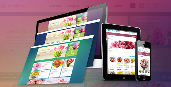
Pav Floral is innovative Responsive Opencart Theme design that can be a perfect choice for establishing a modern online Flower shop, Gift Store or a Handmade boutique

And also this is an innovative Opencart Template that can be a perfect choice for establishing any kind of business or eCommerce website. Pav Floral Store Responsive is one of great opencart template built on pavo framework version 2.0 and bootstrap version 3.0 to make fully responsive theme that works perfect on all kind of resolutions as well for mobile, tablet, desktop having medium and large screen. With powered by the framework the theme support you many great tools to customize theme via using Live Theme Editor, Auto loading custom css files support you creating unlimited of theme profiles without code very easy and simple.

The Opencart Template included three skin colors, great Content Slider Module having Many Animation JQuery Effect, Google Fonts, Power Megamenu Module having great design Make Mega Column Tool and many other nice modules.

[UPDATE] This theme have improved two skins using for Christmas day!!!

Features

  • Compatible with Opencart 1.5.5, Opencart 1.5.6, opencart 2.0, 2.1
  • Support Wide Screen 1170px, 980px
  • Built-in Pavo Framework Version 2.0 and Bootstrap 3.0
  • No Hacking Core Opencart Codes
  • HTML5 and CSS3 Support
  • Full Responsive Theme
  • Google Fonts
  • [NEW] Integrated Mega Menu Module With Lightweight Megamenu Editor Tool
  • Integrated Blog Module
  • Integrated Pav SlideShow Module
  • Valid XHTML and CSS markup
  • Eeasy control theme such as skin changer, font-changer, modules – position via Control Panel Module
  • Easy Use and Easy Customize As great for customwork
  • Support Add Custom Javascript, Css, Change Background
  • [NEW]Improved Awesome Font
  • Support Multiple Layout – Position, Allow drag and drop modules
  • [New] Off Canvas Menu and SideBars Support , Display Very nice on Handhelds and Easy to customize
  • [New] Support Multiple Zoom types: Basic Zoom, Inner Zoom, Lens Zoom, Gallery Slider Zoom, Basic Gallery Zoom
  • [New] Quick Popup Zoom Image In Product Listing
  • [New] Support Display Sale Label for Listing Products and Product Detail, In Module Carousel…
  • [New] Support Less Development
  • [New] Live Theme Edtior to create unlimited Theme Skins Without Coding
  • [New] Support Adding Custom Css and JS Code In Theme Control Module
  • [New] Support Css Compression to improve Site performence
  • [New] Easy install datasample, theme, modules on existed store
  • [New] Support Multiple Language And RTL Language

Explore BackEnd Demo

Explore Via Docs Guide

Explore Via Video Guides Powered by Pavo Framework 2

Flexible Layouts – Modules

Great Layout Concept

Highlight

Support Ways

Change Logs

  • 20 April 2015: Updated new version opencart 2.0.2.0 for quickstart package
  • 28 Jan 2015: created new version for opencart 2.0
  • 04/15/2014: Fix live theme editor customize. + Css list and grid manufacturer Menu sub of categor. + Update quickstart with OPencart 1.5.6.2
  • 02/05/2014: fixed colorbox missing right and left border. Thanks
  • 01/16/2014: update quickstart with opencart version 1.5.6.1
  • 01/02/2014 + re-update datasample
  • 11/26/2013:+ some updates Update Framework with latest version
  • Update Module latest Update Font Awesome Version 4.0.3
  • Fix button review Fix search input ie Fix sys-notification

Flowy - Responsive Under Construction Template

Flowy - Responsive Under Construction Template

Flowy is a fully responsive Under Construction Template with a twist. With a minimalist and flat blue design, the countdown is smoothly animated – as the time goes down the ‘water’ flows out of the circles.

This template features a working AJAX email subscription form, which can save addresses to MySQL, send addresses to your email, or add them to MailChimp lists.

The theme is fully responsive, so will work on any sized screen. Also, a pack of 99 Social Icons is included – so you can have almost any icon you desire on your under construction page.

As well as the animated jQuery countdown, the design also features a CSS3 animated intro. Everything apart from the countdown itself gently fades in.

There is a space for your logo, and Google Web Fonts is used allowing easy customisation of Fonts.

Flowy Under Construction is completely valid HTML5, compatible with all major browsers – and is very simple to set up and customise, due to extensive documentation.

Please remember to rate this item!

Follow us on Twitter | Read our articles on WebdesignTuts+

Features

  • Fully Responsive, works with mobile devices
  • Working AJAX Form, which saves addresses to MySQL, emails them to you, or saves them to MailChimp Lists.
  • MailChimp Support
  • Animated jQuery Countdown
  • Includes pack of 99 Social Icons
  • Simple CSS3 Animated Intro (everything except countdown fades in, optional)
  • Google Web Fonts
  • Modern, minimalist and flat design
  • Extensive Documentation and code comments make Flowy very easy to use, customise and set up

Serenity - Minimal Responsive Shopify Theme

Serenity - Minimal Responsive Shopify Theme

Serenity Theme : Minimal, responsive and clean design for Shopify eCommerce that fit all modern shops and boutiques. It comes with a plethora of options so you can modify layout, styling, colors and fonts directly from within the backend.

With easy-to-configure theme settings, we can guarantee you can customize your shop just in less than 5 minutes.

Special Features

  • Advanced typography options
  • Wide & boxed layout versions
  • Extra Widgets : 3 Footer announcement Text Widgets – Left side banner widget and Text widget
  • Unlimited color options with backend color picker for any kind of gorgeous color settings.
  • Compatible with Shopify 2.0
  • Minimalist, and clean design concept
  • Fully Responsive design – mobile, tablet and computer version
  • Automated meta open graph tag and SEO ready
  • Unlimited Google Fonts
  • Two preset theme as a base to start; light and dark version
  • Rich snippets ready for products

Other Features

  • Easy installation and customitaion
  • Slideshow and banner options
  • Text and image logo options
  • Clear and well separated Theme Settings
  • More than 350+ font icons to be used
  • 14 payment method icons
  • 3 template option; left side, right side or without sidebar
  • Custom CSS section ready
  • Written with HTML5 and CSS3
  • Beautiful typography
  • Drop down menu support
  • Social media sharing
  • Customizable sidebar
  • SEO optimized
  • Full width page layout
  • Newsletter signup form
  • Compatible with all major modern browsers.
  • Slideshow, banners , Shop Sidebar Banner , Text Widget , Footer Text Widgets , Quick Links e.g widgets
  • And many more..

Update Notes

++ 1 Oct. 2014- Update Bootstrap 3.2.0  (All theme parts updated)- Fixed Responsive Problem
++ 5 August 2014- Update Flex Slider- Update Maps- Add Retina JS- Update Js Functions
++ 5 August 2014- Added new 15 design options for footer- Added new 8 design  options for product box- Added new 7 design  options for header mini shopping cart- Added new 6 design  options for homepage items
++05/02/2014- Fixed : CSS problems- Fixed : background functions

Darkley | Mobile HTML/CSS Portfolio Template

Darkley | Mobile HTML/CSS Portfolio Template

\\\\

darkley | Mobile HTML/CSS Portfolio Template

Dark, simple, modern but with all the features you’d need!

This mobile portfolio template adapts to any mobile device. It has no fixed sizes for specific devices, and runs on any screen size, and orientation.

HiDPI ready means it will look sharp on any HiDPI display, including retina.

Main Features

  • 12 Page Templates
  • Working Contact Form
  • 6 Color Schemes
  • Custom CSS Framework
  • Valid HTML/CSS
  • Liquid Structure (it adapts to any screen size)
  • HiDPI Ready

Other Features:

  • 48 small icons (24 light, 24 dark)
  • 48 services icons (24 light, 24 dark)
  • 24 social icons (12 light, 12 dark)
  • 24 button icons
  • 6 color styles for the buttons
  • a custom structure which (it includes secondary Css files for you to add your custom rules in) allows you to customize the template and still be able to update it later on without breaking anything
  • free support for bug fixes

Useful Add-ons:

Notes:

The images you see in the preview are not included in your “source” ZIP. You will receive place-holders.

\\\\